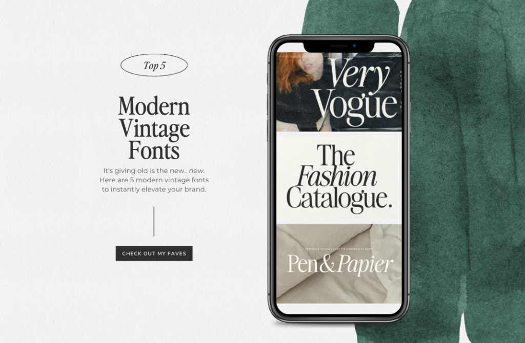
Old is the new… new. While all the other design-obsessed girlies are salivating over super stylistic modern fonts (and don’t get me wrong I’m loving them too) – I have a special place in my heart for retro-inspired fonts because they add a nostalgic yet timeless feel to any design project or brand.
Although a thing of the past, the retro design style still continues to be a favorite among designers because of its versatility and how it can give any creative project a unique feel. And if we’ve learned anything from fashion, trends are cyclical and anything that was once considered old, will be new again. I definitely just bought a pair of bell bottoms last week.
Retro typography is a great element to add to any design project whether the style of your design is modern minimalist or mid-century classic. When used properly, a vintage font can either support or contrast a particular design style, hook your audience visually, and make your brand stand out from the bunch.
Investing in a high-quality font is one of the best and easiest ways to instantly elevate your brand. Instead of using a free font that literally everybody and their mama could be using, think about paying for one that best reflects your vision for your brand and your target demographic.
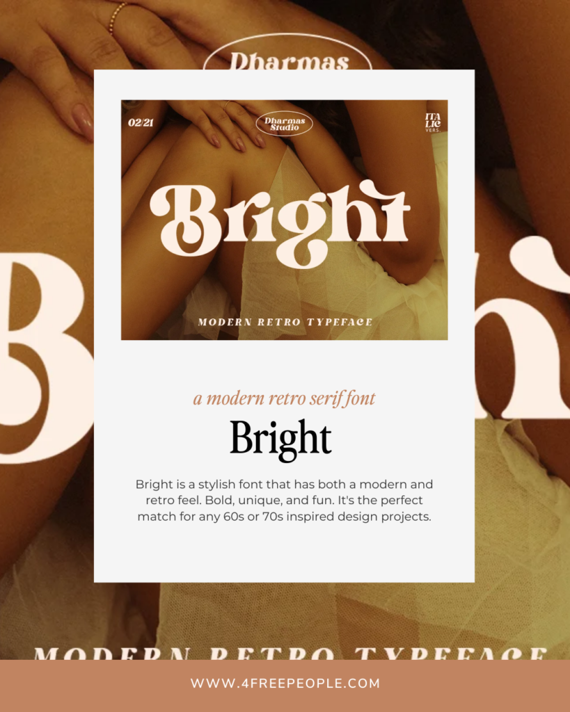
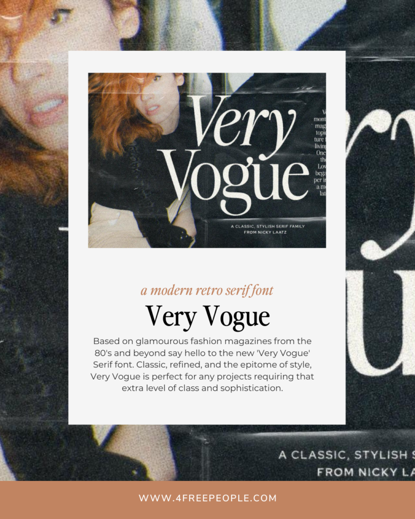
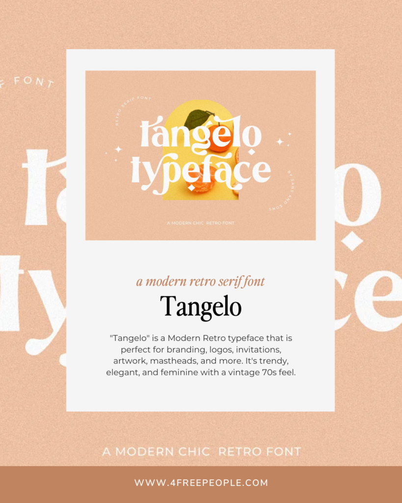
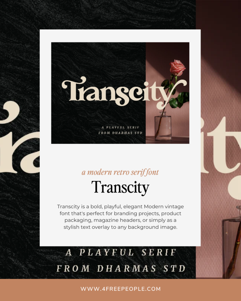
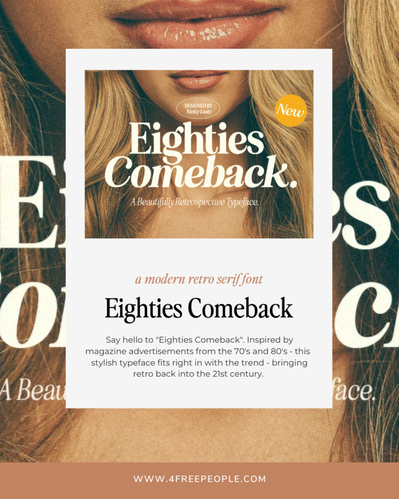
Here are 5 of my favorite modern vintage serif fonts at the moment.
Click on the image to check out the font and just for *transparency* – I do receive a small kickback from Creative Market if you decide to purchase any of these.
I hope you liked this post! Be sure to sign up on my mailing list for your monthly freebie along with tips and tools for building a Conscious brand. Which font is your favorite?
Love this I’m in the process of making my website and a good font was giving me the most trouble